Editable text-field game object. More...
#include <inputfield_object.hpp>
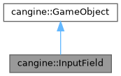
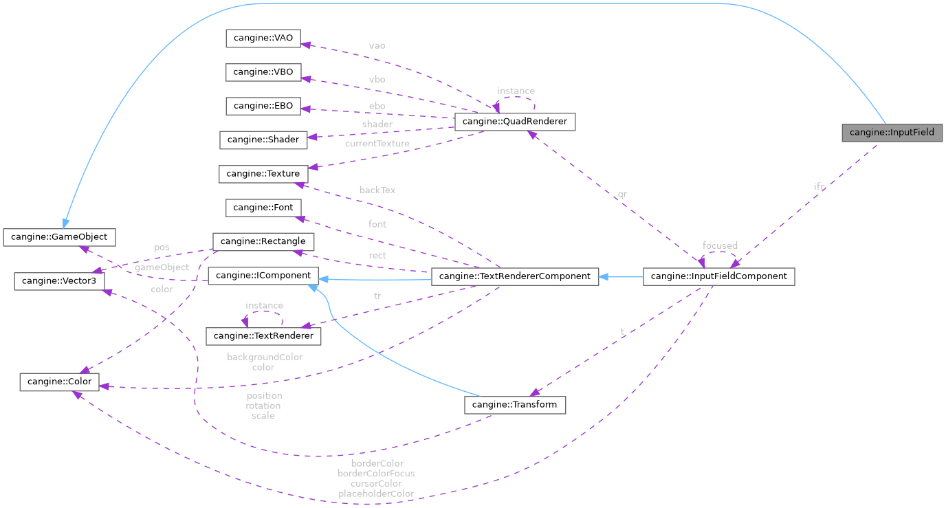
Public Member Functions | |
| InputField () | |
| Constructs an input field with a default style. | |
| void | setContent (std::string contentIn) |
| Sets the field's text content and refreshes the view. | |
| void | setPlaceholder (std::string placeholderIn) |
| Sets the placeholder text shown when empty. | |
| void | setCursorPos (int posIn) |
| Sets the caret position and refreshes the view. | |
| void | setWidth (float widthIn) |
| Sets the field width. | |
| void | setHeight (float heightIn) |
| Sets the field height (and scales the font to match). | |
| void | setBorderWidth (float widthIn) |
| Sets the border thickness. | |
| void | setPlaceHolderColor (Color colorIn) |
| Sets the placeholder text color. | |
| void | setBorderColor (Color colorIn) |
| Sets the border color when unfocused. | |
| void | setBorderColorFocus (Color colorIn) |
| Sets the border color when focused. | |
| void | setCursorColor (Color colorIn) |
| Sets the caret color. | |
| void | setBackgroundColor (Color colorIn) |
| Sets the field background color. | |
| void | setColor (Color colorIn) |
| Sets the text color. | |
| void | setOnReturn (std::function< void(std::string)> functionIn) |
| Sets the callback invoked when Enter is pressed. | |
| InputFieldComponent * | getIFC () |
| Returns the underlying input field component. | |
| const std::string & | getContent () const |
| Returns the current content. | |
| const std::string & | getPlaceholder () const |
| Returns the placeholder text. | |
| int | getCursorPos () const |
| Returns the caret position. | |
| float | getWidth () const |
| Returns the field width. | |
| float | getHeight () const |
| Returns the field height. | |
| float | getBorderWidth () const |
| Returns the border thickness. | |
| const Color & | getPlaceholderColor () const |
| Returns the placeholder text color. | |
| const Color & | getBorderColor () const |
| Returns the unfocused border color. | |
| const Color & | getBorderColorFocus () const |
| Returns the focused border color. | |
| const Color & | getCursorColor () const |
| Returns the caret color. | |
| const Color & | getBackgroundColor () const |
| Returns the background color. | |
| const Color & | getColor () const |
| Returns the text color. | |
 Public Member Functions inherited from cangine::GameObject | |
| GameObject () | |
| virtual | ~GameObject () |
| virtual void | onUpdate (double deltaTime) |
| Per-frame update hook. | |
| virtual void | onMouseEvent (const MouseEvent *e) |
| Mouse event hook. | |
| virtual void | onDisable () |
| Called when the object becomes inactive. | |
| virtual void | onEnable () |
| Called when the object becomes active. | |
| void | destroy () |
| Marks the object for destruction by the ObjectManager. | |
| template<typename T > | |
| void | appendComponent (T *component) |
| Attaches an existing component to this object. | |
| template<typename T > | |
| void | destroyComponent () |
| Destroys and removes the first component of a type. | |
| template<typename T > | |
| T * | getComponent () |
| Returns the first attached component of a type. | |
| template<typename T > | |
| std::vector< T * > | getComponents () |
| Returns all attached components of a type. | |
| template<typename T , typename... Args> | |
| T * | newComponent (Args &&... args) |
| Constructs a component in place and attaches it. | |
| void | setActive (bool a) |
| Activates or deactivates the object. | |
| bool | isActive () |
| Reports whether the object is active. | |
Private Attributes | |
| InputFieldComponent * | ifc |
| Component implementing the input field. | |
Detailed Description
Editable text-field game object.
A thin convenience wrapper around InputFieldComponent, exposing getters and setters for the field's content, style and the on-return callback so it can be configured without touching the component.
Constructor & Destructor Documentation
◆ InputField()
| cangine::InputField::InputField | ( | ) |
Constructs an input field with a default style.
Member Function Documentation
◆ getBackgroundColor()
Returns the background color.
- Returns
- Reference to the background color.
◆ getBorderColor()
Returns the unfocused border color.
- Returns
- Reference to the border color.
◆ getBorderColorFocus()
Returns the focused border color.
- Returns
- Reference to the focused border color.
◆ getBorderWidth()
|
inline |
Returns the border thickness.
- Returns
- Border width in pixels.
◆ getColor()
Returns the text color.
- Returns
- Reference to the text color.
◆ getContent()
|
inline |
Returns the current content.
- Returns
- Reference to the content string.
◆ getCursorColor()
Returns the caret color.
- Returns
- Reference to the caret color.
◆ getCursorPos()
|
inline |
Returns the caret position.
- Returns
- Caret index into the content.
◆ getHeight()
|
inline |
Returns the field height.
- Returns
- Height in pixels.
◆ getIFC()
|
inline |
Returns the underlying input field component.
- Returns
- The InputFieldComponent.
◆ getPlaceholder()
|
inline |
Returns the placeholder text.
- Returns
- Reference to the placeholder string.
◆ getPlaceholderColor()
Returns the placeholder text color.
- Returns
- Reference to the placeholder color.
◆ getWidth()
|
inline |
Returns the field width.
- Returns
- Width in pixels.
◆ setBackgroundColor()
Sets the field background color.
- Parameters
-
colorIn New color.
◆ setBorderColor()
Sets the border color when unfocused.
- Parameters
-
colorIn New color.
◆ setBorderColorFocus()
Sets the border color when focused.
- Parameters
-
colorIn New color.
◆ setBorderWidth()
Sets the border thickness.
- Parameters
-
widthIn New border width in pixels.
◆ setColor()
Sets the text color.
- Parameters
-
colorIn New color.
◆ setContent()
|
inline |
Sets the field's text content and refreshes the view.
- Parameters
-
contentIn New content string.
◆ setCursorColor()
Sets the caret color.
- Parameters
-
colorIn New color.
◆ setCursorPos()
Sets the caret position and refreshes the view.
- Parameters
-
posIn New caret index into the content.
◆ setHeight()
Sets the field height (and scales the font to match).
- Parameters
-
heightIn New height in pixels.
◆ setOnReturn()
Sets the callback invoked when Enter is pressed.
- Parameters
-
functionIn Callback receiving the field content.
◆ setPlaceholder()
|
inline |
Sets the placeholder text shown when empty.
- Parameters
-
placeholderIn New placeholder string.
◆ setPlaceHolderColor()
Sets the placeholder text color.
- Parameters
-
colorIn New color.
◆ setWidth()
Sets the field width.
- Parameters
-
widthIn New width in pixels.
Member Data Documentation
◆ ifc
|
private |
Component implementing the input field.
The documentation for this class was generated from the following files:
- cangine/src/cangine/engine/gameobjects/ui/inputfield_object.hpp
- cangine/src/cangine/engine/gameobjects/ui/inputfield_object.cpp